💂 个人主页:pp不会算法v
🤟 版权: 本文由【pp不会算法v】原创、在CSDN首发、需要转载请联系博主
💬 如果文章对你有帮助、欢迎关注、点赞、收藏(一键三连)和订阅专栏哦
QML系列教程
QML教程一:布局组件
文章目录
- 列表视图ListView
-
- 网格视图GridView
-
- 表格视图TableView
-
- 滚动视图ScrollView
-
- 树形视图TreeView
-
- 分页视图TabView
-
- 拆分视图SplitView
-
- 滑动视图SwipeView
-
- 路径视图PathView
-
列表视图ListView
属性
| 属性名 | 是否只读 | 说明 | 默认值 |
|---|
| add | | 添加元素时的过渡效果。 | 无 |
| addDisplaced | | 添加元素时其他元素受到影响的过渡效果。 | 无 |
| cacheBuffer | | 缓存区域大小,用于视图快速滑动时提高性能。 | 0 |
| count | 只读 | 列表项数量。 | 0 |
| currentIndex | | 当前选中项的索引。 | -1 |
| currentItem | | 当前选中项的Item对象。 | null |
| currentSection | 只读 | 当前选中项所在分段的标签。 | “” |
| delegate | | 定义每个列表项的组件。 | null |
| displaced | | 删除元素时其他元素受到影响的过渡效果。 | 无 |
| displayMarginBeginning | | 起始边缘显示区域大小。 | 0 |
| displayMarginEnd | | 结束边缘显示区域大小。 | 0 |
| effectiveLayoutDirection | 只读 | 由 layoutDirection 和 QT 的国际化功能决定的实际布局方向。 | Qt.LeftToRight |
| footer | | 列表脚部的组件。 | null |
| footerItem | 只读 | 列表脚部的Item对象。 | null |
| footerPositioning | | 列表脚部的位置。 | ListView.End |
| header | | 列表头部的组件。 | null |
| headerItem | 只读 | 列表头部的Item对象。 | null |
| headerPositioning | | 列表头部的位置。 | ListView.Beginning |
| highlight | | 当前选中项的视觉效果。 | null |
| highlightFollowsCurrentItem | | 当前选中项改变时,是否更新 highlightItem 的属性。 | true |
| highlightItem | 只读 | 当前选中项的Item对象。 | null |
| highlightMoveDuration | | 视觉效果移动时长。 | 250 |
| highlightMoveVelocity | | 视觉效果移动速度。 | 0 |
| highlightRangeMode | | 高亮模式。 | ListView.StrictlyEnforceRange |
| highlightResizeDuration | | 视觉效果大小变化时长。 | 50 |
| highlightResizeVelocity | | 视觉效果大小变化速度。 | 0 |
| keyNavigationEnabled | | 是否响应键盘导航事件。 | true |
| keyNavigationWraps | | 是否在到达列表边界时循环导航。 | false |
| layoutDirection | | 布局方向。 | Qt.LeftToRight |
| model | | 列表使用的模型对象。 | null |
| move | | 移动元素时的过渡效果。 | 无 |
| moveDisplaced | | 移动元素时其他元素受到影响的过渡效果。 | 无 |
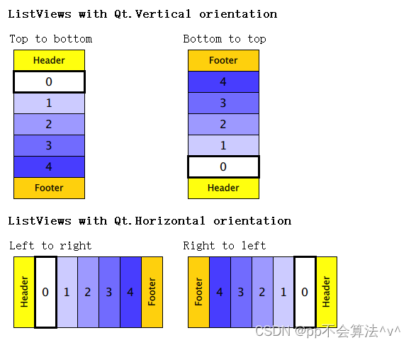
| orientation | | 列表方向。 | Qt.Vertical |
| populate | | 初始化时添加元素的过渡效果。 | 无 |
| preferredHighlightBegin | | 高亮条的起始位置。 | 0 |
| preferredHighlightEnd | | 高亮条的结束位置。 | 0 |
| remove | | 删除元素时的过渡效果。 | 无 |
| removeDisplaced | | 删除元素时其他元素受到影响的过渡效果。 | 无 |
| section | | 分段列表项属性的信息。 | 无 |
| section.property | | 分段属性名。 | undefined |
| section.criteria | | 分段标准。 | ListView.Direct |
| section.delegate | | 定义每个分段的组件。 | null |
| section.labelPositioning | | 分段列表中标签的位置。 | ListView.SectionLeading |
| snapMode | | 滑动到指定位置时是否对齐。 | ListView.NoSnap |
| spacing | | 列表项之间的间距。 | 0 |
| verticalLayoutDirection | | 垂直布局方向。 | ListView.TopToBottom |
信号
| 信号名 | 说明 |
|---|
| add() | 添加元素后触发。 |
| remove() | 删除元素后触发。 |
函数
| 方法名 | 说明 |
|---|
| decrementCurrentIndex() | 将 currentIndex 属性值减一。 |
| forceLayout() | 强制进行重新布局。 |
| incrementCurrentIndex() | 将 currentIndex 属性值加一。 |
| indexAt(real x, real y) | 返回指定坐标处的列表项索引。 |
| itemAt(real x, real y) | 返回指定坐标处的列表项 Item 对象。 |
| positionViewAtBeginning() | 将当前视图滚动至最开始位置。 |
| positionViewAtEnd() | 将当前视图滚动至最末尾位置。 |
| positionViewAtIndex(int index, PositionMode mode) | 将视图滚动至指定索引处。关于 PositionMode 枚举类型的取值意义,可查看 官方文档。 |
示例
ListView {id:viewhighlight: Item{Rectangle { color: "lightsteelblue"; radius: 5 }}focus: truespacing:10width: parent.widthheight: parent.height*(2/3)model:10orientation: "Horizontal"delegate:Rectangle {width: view.width/4height: view.heightcolor: "pink"Text {text: "rect" + index}}

网格视图GridView
属性
| 属性名 | 类型 | 描述 |
|---|
| add | Transition | 在GridView中添加项的过渡动画 |
| addDisplaced | Transition | 在GridView中添加位移项的过渡动画 |
| cacheBuffer | int | 缓存项数量 |
| cellHeight | real | 单元格高度 |
| cellWidth | real | 单元格宽度 |
| count | int | 项数 |
| currentIndex | int | 当前项的索引 |
| currentItem | Item | 当前项 |
| delegate | Component | 用于创建项的委托 |
| displaced | Transition | 移除GridView中的位移项的过渡动画 |
| displayMarginBeginning | int | 起始边距 |
| displayMarginEnd | int | 结束边距 |
| effectiveLayoutDirection | enumeration | 有效布局方向(从左到右或从右到左) |
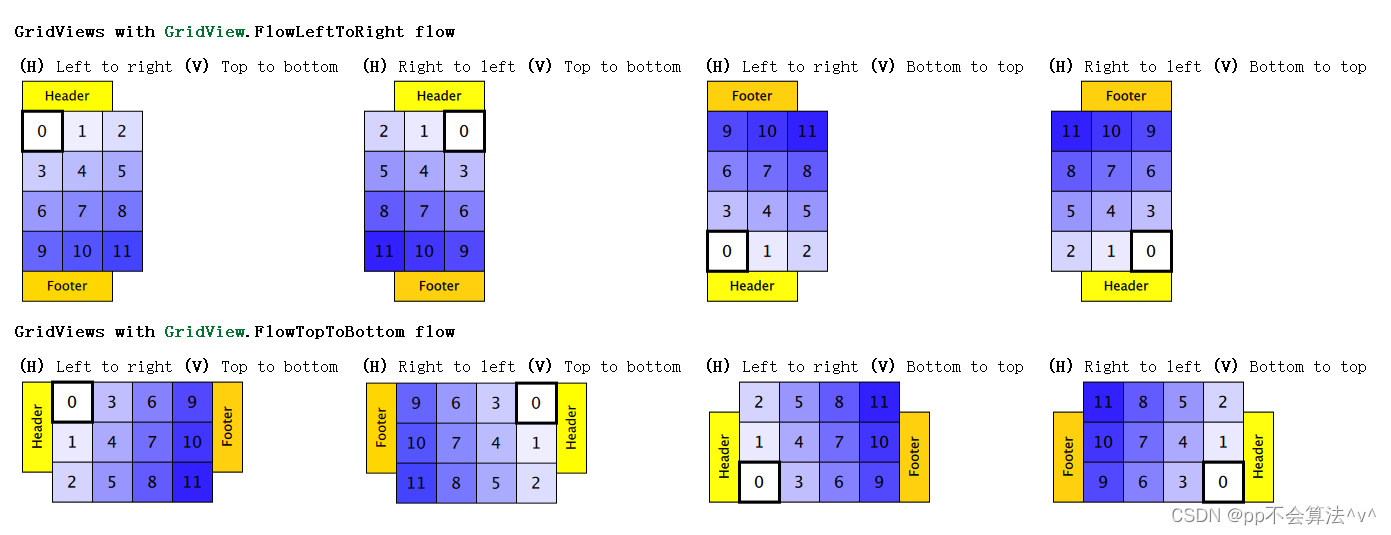
| flow | enumeration | 流程方向(水平、垂直或倾斜) |
| footer | Component | 页脚组件 |
| footerItem | Item | 页脚项 |
| header | Component | 页眉组件 |
| headerItem | Item | 页眉项 |
| highlight | Component | 高亮项的委托 |
| highlightFollowsCurrentItem | bool | 高亮项是否始终跟随当前项 |
| highlightItem | Item | 要高亮的项 |
| highlightMoveDuration | int | 高亮项移动过渡时间(以毫秒为单位) |
| highlightRangeMode | enumeration | 高亮项模式,用于指定将哪些项考虑为高亮范围 |
| keyNavigationEnabled | bool | 是否启用键盘导航 |
| keyNavigationWraps | bool | 当到达最后一项或第一项时,是否循环到另一端 |
| layoutDirection | enumeration | 布局方向(从左到右或从右到左) |
| model | model | 数据模型 |
| move | Transition | 移除GridView中的项的过渡动画 |
| moveDisplaced | Transition | 移除GridView中的位移项的过渡动画 |
| populate | Transition | 在GridView中填充所有项的过渡动画 |
| preferredHighlightBegin | real | 高亮框开始位置的推荐值 |
| preferredHighlightEnd | real | 高亮框结束位置的推荐值 |
| remove | Transition | 移除GridView中的项的过渡动画 |
| removeDisplaced | Transition | 移除GridView中的位移项的过渡动画 |
| snapMode | enumeration | 自动对齐模式(禁用、开始、中间或结束位置) |
| verticalLayoutDirection | enumeration | 垂直布局方向(从上到下或从下到上) |
信号
| 信号名 | 描述 |
|---|
| add() | 当在GridView中添加项时发出 |
| remove() | 当在GridView中删除项时发出 |
| currentIndexChanged(int index) | 当当前项的索引更改时发出 |
函数
| 函数名 | 描述 |
|---|
| forceLayout() | 强制对GridView进行重新布局 |
| indexAt(real x, real y) | 返回位于指定坐标的项的索引 |
| itemAt(real x, real y) | 返回位于指定坐标的项 |
| moveCurrentIndexDown() | 将当前项向下移动一格 |
| moveCurrentIndexLeft() | 将当前项向左移动一格 |
| moveCurrentIndexRight() | 将当前项向右移动一格 |
| moveCurrentIndexUp() | 将当前项向上移动一格 |
| positionViewAtBeginning() | 将视图位置设置为第一项 |
| positionViewAtEnd() | 将视图位置设置为最后一项 |
| positionViewAtIndex(int index, PositionMode mode) | 将视图位置设置为指定索引处的项,使用指定的位置模式 |
示例
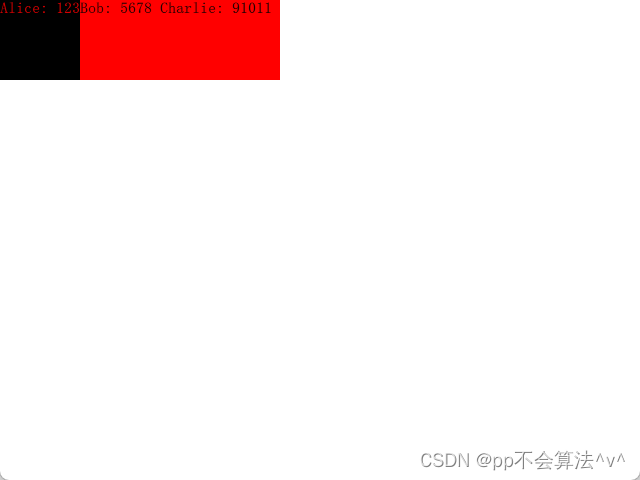
GridView {width: 300; height: 200cellWidth: 80; cellHeight: 80model: ListModel {ListElement { name: "Alice"; number: "1234" }ListElement { name: "Bob"; number: "5678" }ListElement { name: "Charlie"; number: "91011" }}Component {id: contactsDelegateRectangle {id: wrapperwidth:120height: 80color: GridView.isCurrentItem ? "black" : "red"Text {id: contactInfotext: name + ": " + numbercolor: wrapper.GridView.isCurrentItem ? "red" : "black"}}}delegate: contactsDelegatefocus: true}
表格视图TableView
好的,以下是根据你提供的属性、信号和方法的详细表格,使用Markdown语法排版:
属性
| 属性名 | 类型 | 描述 |
|---|
| columnSpacing | real | 列间距 |
| columnWidthProvider | var | 列宽度提供者 |
| columns | int | 列数 |
| contentHeight | real | 内容高度 |
| contentWidth | real | 内容宽度 |
| delegate | Component | 项委托 |
| model | model | 模型 |
| reuseItems | bool | 是否重用项 |
| rowHeightProvider | var | 行高度提供者 |
| rowSpacing | real | 行间距 |
| rows | int | 行数 |
| view | TableView | 所属的TableView视图 |
信号
| 信号名 | 描述 |
|---|
| pooled() | 池化时触发的信号 |
| reused() | 重用时触发的信号 |
方法
示例
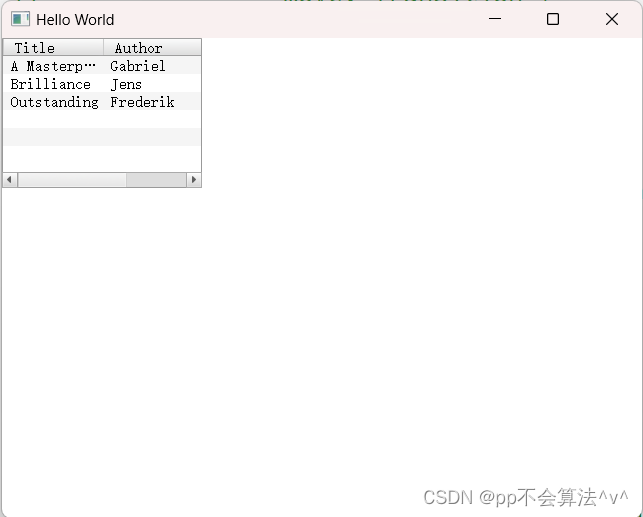
ListModel {id: libraryModelListElement {title: "A Masterpiece"author: "Gabriel"}ListElement {title: "Brilliance"author: "Jens"}ListElement {title: "Outstanding"author: "Frederik"}}TableView {TableViewColumn {role: "title"title: "Title"width: 100}TableViewColumn {role: "author"title: "Author"width: 200}model: libraryModel}
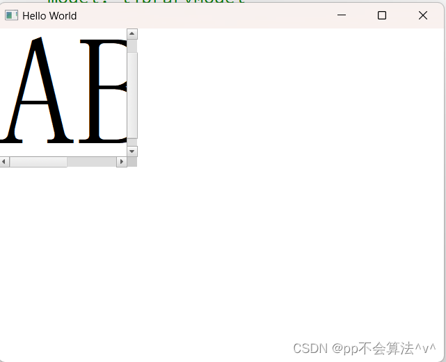
滚动视图ScrollView
属性
| 属性 | 说明 |
|---|
| contentChildren : list | 该列表包含已在QML中声明为视图的子项的所有项。 |
| contentData : list | 该列表包含已在QML中声明为视图的子对象的所有对象。 |
示例
ScrollView {width: 200height: 200clip: trueLabel {text: "ABC"font.pixelSize: 224}}
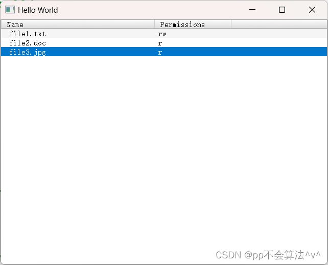
树形视图TreeView
属性
| 属性 | 描述 |
|---|
| currentIndex | 当前选中的 table view 单元格 |
| itemDelegate | 表格单元格使用的代理组件 |
| model | 用于显示表格数据的 model |
| rootIndex | 表示模型中一个项目的索引,它可作为 TableView 视图项的根索引 |
| section | 指定表头的一般特性以及每个表头所代表的列或行的选择准则 |
| selection | 存储当前所选项的模型。 |
信号
| 信号 | 描述 |
|---|
| activated(QModelIndex index) | 当用户双击或者按下 Enter 键时发出。 |
| clicked(QModelIndex index) | 当用户单击一个单元格时发出 |
| collapsed(QModelIndex index) | 当用户折叠一个项时发出 |
| doubleClicked(QModelIndex index) | 当用户双击一个单元格时发出 |
| expanded(QModelIndex index) | 当用户展开一个项时发出 |
| pressAndHold(QModelIndex index) | 当用户按住一个项时发出 |
函数
| 函数 | 描述 |
|---|
| void collapse(QModelIndex index) | 折叠一个项 |
| void expand(QModelIndex index) | 展开一个项 |
| QModelIndex indexAt(int x, int y) | 返回在点 (x, y) 处找到的表格单元格的 QModelIndex;如果这个点不在任何一个表格单元格内,则返回无效的 QModelIndex |
| bool isExpanded(QModelIndex index) | 检查给定的索引是否已经展开 |
示例
ListModel {id: fileSystemModelListElement {fileName: "file1.txt"filePermissions: "rw"}ListElement {fileName: "file2.doc"filePermissions: "r"}ListElement {fileName: "file3.jpg"filePermissions: "r"}}TreeView {width: parent.widthheight: parent.heightTableViewColumn {title: "Name"role: "fileName"width: 300}TableViewColumn {title: "Permissions"role: "filePermissions"width: 150}model: fileSystemModel}
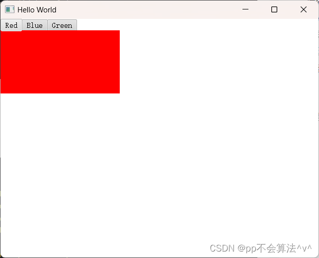
分页视图TabView
属性
| 属性名 | 类型 | 描述 |
|---|
| contentItem | Item | TabView 的内容项。 |
| count | int | 当前的标签页数量。 |
| currentIndex | int | 当前选中的标签页索引。 |
| frameVisible | bool | 标签页内容周围边框的可见性。 |
| tabPosition | int | 标签的位置,默认为顶部。可选值为 Qt.TopEdge(顶部)和 Qt.BottomEdge(底部)。 |
| tabsVisible | bool | 标签栏的可见性。 |
函数
| 函数名 | 参数类型 | 描述 |
|---|
| addTab | string, Component | 添加一个指定标题和组件的新标签页。 |
| getTab | int | 返回指定索引处的 Tab 对象。 |
| insertTab | int, string, Component | 在指定索引处插入一个具有指定标题和组件的新标签页。 |
| moveTab | int, int | 将一个标签页从一个索引位置移动到另一个。 |
| removeTab | int | 移除并销毁指定索引处的标签页。 |
示例
TabView {Tab {title: "Red"Rectangle { color: "red" }}Tab {title: "Blue"Rectangle { color: "blue" }}Tab {title: "Green"Rectangle { color: "green" }}}
拆分视图SplitView
SplitView是一个控件,用于水平或垂直排列项目,每个项目之间有一个可拖动的拆分器。
SplitView中始终有一个(并且只有一个)项目的Layout.fillWidth设置为true(或者Layout.fillHeight,如果方向为Qt.Vertical)。这意味着在布局其他项目时,该项目将获得所有剩余空间。默认情况下,SplitView的最后一个可见子项将具有此设置,但可以通过在另一个项上将fillWidth显式设置为true来更改此设置。
由于fillWidth项目将自动调整大小以适应额外的空间,因此将忽略对其宽度和高度属性的显式指定(但仍将尊重Layout.miminimumWidth和Layout.maxiumWidth)。其他项目的初始尺寸应通过其宽度和高度属性进行设置。一旦用户拖动项目的拆分器句柄,对该项目的宽度或高度的任何绑定分配都将被打断。
手柄可以属于左侧或上侧的项目,也可以属于右侧或下侧的项目: 如果fillWidth项在右侧:则句柄属于左侧项。
如果fillWidth项在左侧:句柄属于右侧项。
属性
| 属性名 | 类型 | 描述 |
|---|
| handleDelegate | Component | 定义拖拽调整分割条操作时使用的图形元素。 |
| orientation | int | 分割条的方向。可选值为 Qt.Horizontal(水平方向)和 Qt.Vertical(竖直方向)。 |
| resizing | bool | 指定是否允许用户拖拽调整分割条大小。默认值为 true。 |
函数
| 函数名 | 参数类型 | 描述 |
|---|
| addItem | Item | 在 SplitView 中添加一个项。 |
| removeItem | Item | 从 SplitView 中移除一个项。 |
示例
SplitView {anchors.fill: parentorientation: Qt.HorizontalRectangle {width: 200Layout.maximumWidth: 400color: "lightblue"Text {text: "View 1"anchors.centerIn: parent}}Rectangle {id: centerItemLayout.minimumWidth: 50Layout.fillWidth: truecolor: "lightgray"Text {text: "View 2"anchors.centerIn: parent}}Rectangle {width: 200color: "lightgreen"Text {text: "View 3"anchors.centerIn: parent}}}

滑动视图SwipeView
允许滑动的多页窗口
属性
| 属性名 | 是否只读 | 说明 | 默认值 |
|---|
| horizontal | 只读 | 是否为横向的滑动视图。 | 无 |
| interactive | | 是否允许用户进行交互操作。 | true |
| orientation | | 视图的方向,可选值为“Horizontal”和“Vertical”。 | “Horizontal” |
| vertical | 只读 | 是否为纵向的滑动视图。 | 无 |
示例
SwipeView {id: viewcurrentIndex: 1anchors.fill: parentItem {id: firstPageText{anchors.centerIn:parenttext:"第一页"}}Item {id: secondPageText{anchors.centerIn:parenttext:"第二页"}}Item {id: thirdPageText{anchors.centerIn:parenttext:"第三页"}}}PageIndicator {id: indicatorcount: view.countcurrentIndex: view.currentIndexanchors.bottom: view.bottomanchors.horizontalCenter: parent.horizontalCenter}

路径视图PathView
属性
| 属性名 | 类型 | 描述 |
|---|
| cacheItemCount | int | 缓存的项数量 |
| count | int | 项的总数 |
| currentIndex | int | 当前选中项的索引 |
| currentItem | Item | 当前选中的项 |
| delegate | Component | 定义了每个项的视觉外观和布局 |
| dragMargin | real | 拖拽操作的边距 |
| dragging | bool | 是否正在拖拽 |
| flickDeceleration | real | 手势滑动减速度,用于控制滑动停止的速度 |
| flicking | bool | 是否正在进行手势滑动 |
| highlight | Component | 高亮项的视觉外观 |
| highlightItem | Item | 高亮的项 |
| highlightMoveDuration | int | 高亮项移动的持续时间 |
| highlightRangeMode | enumeration | 高亮范围模式,定义了如何确定高亮项的范围 |
| interactive | bool | 是否可以与 PathView 进行交互 |
| maximumFlickVelocity | real | 手势滑动的最大速度 |
| model | model | 数据源模型 |
| movementDirection | enumeration | 项之间的移动方向 |
| moving | bool | 是否正在进行项之间的移动 |
| offset | real | 视图相对于其内容的偏移量 |
| path | Path | 定义路径视图的路径 |
| pathItemCount | int | 路径中的项的数量 |
| preferredHighlightBegin | real | 高亮范围的起始位置,参考值为 0-1 |
| preferredHighlightEnd | real | 高亮范围的结束位置,参考值为 0-1 |
| snapMode | enumeration | 对齐模式,定义了如何对齐项 |
附加属性:
| 属性名 | 类型 | 描述 |
|---|
| isCurrentItem | bool | 是否为当前选中的项 |
| onPath | bool | 指示项是否在路径上 |
| view | PathView | 关联的 PathView 对象 |
信号
| 信号名 | 描述 |
|---|
| dragEnded() | 拖拽结束时发射 |
| dragStarted() | 拖拽开始时发射 |
| flickEnded() | 手势滑动结束时发射 |
| flickStarted() | 手势滑动开始时发射 |
| movementEnded() | 项移动结束时发射 |
| movementStarted() | 项移动开始时发射 |
函数
| 函数名 | 参数类型 | 描述 |
|---|
| decrementCurrentIndex() | | 当前选中项索引减1 |
| incrementCurrentIndex() | | 当前选中项索引加1 |
| indexAt(real x, real y) | real, real | 返回指定位置处的索引 |
| itemAt(real x, real y) | real, real | 返回指定位置处的项 |
| positionViewAtIndex(int index, PositionMode mode) | int, PositionMode | 将视图滚动到指定索引位置 |
示例
Rectangle{anchors.fill: parentComponent{id: delegateColumn{id: wrapperopacity: PathView.isCurrentItem ? 1 : 0.5Image{anchors.horizontalCenter: nameText.horizontalCenterwidth: 64; height: 64source: icon}Text{id: nameTexttext: namefont.pointSize: 16}}}PathView{anchors.fill: parentmodel: ListModel{ListElement{name: "1"icon: "qrc:/qml.jpg"}ListElement{name: "2"icon: "qrc:/qml.jpg"}ListElement{name: "3"icon: "qrc:/qml.jpg"}}delegate: delegatepath: Path{startX: 120; startY: 100PathQuad { x: 120; y: 25; controlX: 260; controlY: 75 }PathQuad { x: 120; y: 100; controlX: -20; controlY: 75 }}}}
